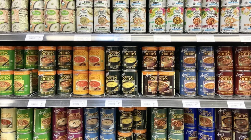




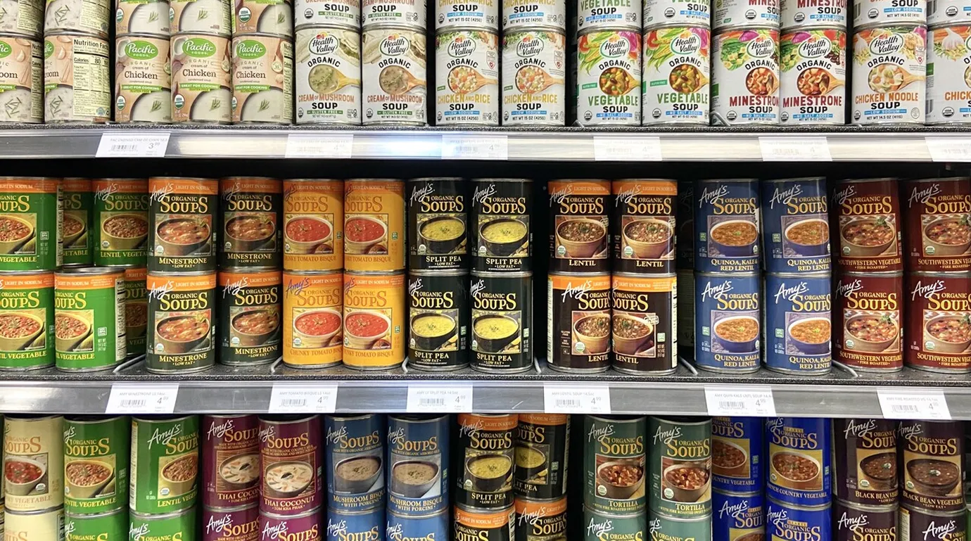
The average grocery store carries over 30,000 items. To the human brain, a supermarket aisle is a chaotic wall of noise. To survive, the brain filters out 99% of what it sees. If your product is part of that filtered 99%, you aren’t just losing a sale, you are becoming invisible.
Most brands think “standing out” means being the loudest. They use neon colors or massive fonts. But on a shelf where everyone is shouting, the loudest brand is often the first one the brain ignores. True shelf impact isn’t about volume; it’s about strategic contrast.
Here is the hard truth: shoppers don’t look at your packaging to see why it’s great. They look at it to find a reason to dismiss it. If you are falling into these three traps, you are making it easy for them to keep walking.
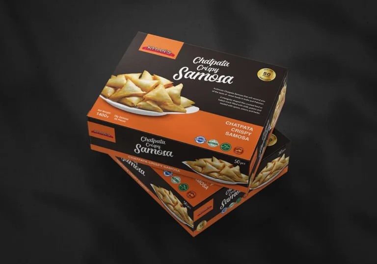
1. You Are Following the Category Cliché If you are selling organic snacks and your packaging is kraft paper with green leaves, you have already lost. You’ve blended into the “organic” wallpaper. By following the category disruption rules, we identify what every other competitor is doing and intentionally pivot. If everyone is using soft illustrations, we use bold, clinical typography. If the aisle is a sea of white, we own the dark space. In retail branding, if you look like everyone else, you are a commodity. If you look different, you are an option.
2. Visual Clutter is Killing Your Conversion
The “Identity Gap” happens when a brand tries to say too much at once. “Non-GMO, Organic, Family Owned, High Protein, Low Carb, Great Taste!” When everything is bold, nothing is bold. A shopper’s eye needs a place to land. High-performance grocery packaging uses a strict visual hierarchy. We pick the one “hero” reason for your existence and let it own the front of the pack. Everything else is secondary. Confusion is the fastest way to lose a customer.
3. You Forgot the “Three-Foot Rule”
A package looks great on a designer’s high-resolution monitor. It looks different from three feet away on a bottom shelf in poor lighting. Many brands fail because their visual identity is too intricate. If your brand name or your “Point of Difference” isn’t legible from the middle of the aisle, you aren’t even in the game. We design for the reality of the store, not the perfection of the artboard.
Your product deserves to be tried, but it will never get that chance if it’s ignored at the point of purchase. Being “safe” in your design is the riskiest move you can make in the grocery sector. You are either the disruptor or the background.
Is your brand currently acting as a background for your competitors? It’s time to stop the scroll in the real world. We offer a complimentary 15-minute visual audit to analyze your current shelf presence and find the “invisibility gaps” that are costing you sales.
Does your current packaging match the quality of your product? Let’s conduct a 15-minute visual audit of your brand.