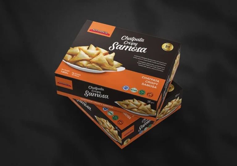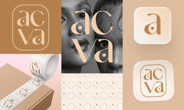






In a crowded grocery aisle, every brand is screaming for attention. Most think the solution is to add more, more colors, more icons, and more text. But in consumer psychology, when everyone is loud, the quietest brand is often the one that gets noticed.
High-performing FMCG packaging doesn’t try to say everything; it says the right thing instantly. If a shopper has to work to understand what you are selling, they will keep walking. Complexity creates confusion, and confusion is the fastest way to kill a sale.
The Three-Second Rule in Visual Identity
A shopper’s brain filters out 90% of what it sees. To pass the filter, your brand design needs a clear visual hierarchy. You have about three seconds to answer three silent questions:
What is this? (Product Category) Why do I need it? (Value Proposition) Why should I trust it? (Brand Authority)
When you strip away the clutter, you allow the “Reason to Buy” to take center stage. This isn’t just about a minimalist aesthetic; it’s about strategic clarity that leads to measurable sales.
Building Brand Authority Through White Space
Clean design signals confidence. Brands that use “white space” effectively often command a higher perceived value. It tells the customer that the product is so good it doesn’t need to over-explain itself. By doing less, you actually achieve more:
- Faster Recognition: A simple shape or bold color is easier to remember than a busy illustration.
- Instant Trust: Clean layouts feel more professional and reliable than cluttered ones.
- Premium Positioning: High-end brands almost always lean toward “less” to signal quality.
Your packaging should be a silent salesperson, not a loud one. If your design is currently fighting for attention with too much noise, it’s time to cut back. In the world of retail branding, the simplest message usually wins the shelf.
Is your packaging doing too much? Let’s see if your brand is getting lost in the noise.We’re offering a 15-minute visual audit to help you identify what to cut so your sales can grow.